
Yahoo Answers is shutting down on May 4th, 2021 (Eastern Time) and the Yahoo Answers website is now in read-only mode. There will be no changes to other Yahoo properties or services, or your Yahoo account. You can find more information about the Yahoo Answers shutdown and how to download your data on this help page.
Trending News

YA fantasy readers - do you hate this cover design any less than the last one?
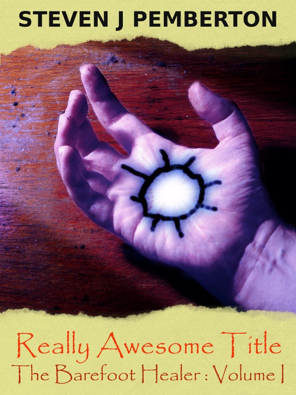
I'm trying to design a new cover for the book I have on Authonomy. The comments I got on my first attempt last week persuaded me to change direction. So here's the second attempt: http://www.pembers.net/wd/test-composite-3.jpg You'll notice that I'm thinking of changing the title too...
My questions are the same as last time:
- Does it look like the cover of a young adult fantasy novel?
- (If you read books like that) Would it persuade you to start reading the book, or find out more about it?
Really, it just has to look better than the current one, which looks like this:
http://www.pembers.net/wd/authonomy-cover-large.pn...
Something to bear in mind is that Authonomy scales cover images to the size of a postage stamp, so if I use the new one, it's going to look like this:
http://www.pembers.net/wd/test-composite-3-thumbna...
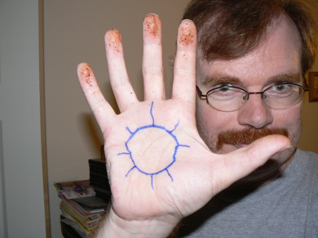
And just because you're such deserving people, here's a behind-the-scenes photo:
http://www.pembers.net/wd/P1120253.JPG The gunk on my fingertips is out of the grill pan in the kitchen. I knew there was a reason I don't wash the dishes every day...
Yeah, the font for the title is Papyrus, which I guess everyone and their dog has, since it is or was bundled with numerous Microsoft products. I didn't have a clear idea of what I wanted, and it was the first one I found in about ten minutes of searching that looked vaguely right. I may have to relearn some calligraphy.
14 Answers
- SealLv 51 decade agoFavorite Answer
Yeah, Papyrus is pretty common - it's a nice font, but the bird who's picking holes in my screen door as well as the dog has it. You could go to one of the many "Download about a thousand fonts free online" sites and look for one similar to Papyrus that you think fits. Or you could pay for a font, but I don't think many people will care - I faintly recall a suggestion by someone that if you're going to (self) publish, you should pay for the font. But I don't know - just a thought. Unless this is just for Authonomy - getting back on track...
It's a lot better than the other two, although it does look a bit scribble-y. And it may just be my queasy little teenage girl mind, but personally that mark looks a bit painful :P So - it's good, and improved, but I think it could still be a bit better.
You know, I was thinking that maybe you could have the picture of a person's (pale? :D) hand in whatever cool gesture with a bit of 'magic' glowing/trailing out? The magic could be green and smoky/wispy or something :p Maybe have a dark background with a glowy, smudged/unclear sun-mark-thing surrounding the central image.
All right, I'll never go into design/graphics, but I was just thinking that showing a magic-y thing with maybe a hand making the magic-y thing appear would better represent the title of a 'healer', even if it doesn't really fit your story *that* much (you know, the magic doesn't really have to be green).
...ahh, anyway, I suppose I'm just trying to say "cool glowy things"?
Meh, well, I did my best. I was putting myself into your average giggly teenage girl's frame of mind, you see.
Now that I think about it, I didn't really need to "put myself" into it. :|
And your behind the scenes photo is very beautiful. Love the blue squiggles, extremely artistic - took a very ingenious and highly gifted, elevated mind... wait - whoa, you have a big thumb. :d Or maybe I just have a small thumb. I shall have to go and check.
EDIT:
All right, so I got bored and thought the whole idea of hands and green smoke was pretty cool, so I went and got myself a picture of some hands and a picture of smoke, cropped, threw it together, and grabbed a smudge tool XD I'm actually pretty proud of it, being technology-stupid as I am. But anyways, if you wanted to get an idea of what I meant :P
http://i1104.photobucket.com/albums/h336/xsharanax...
...maybe scroll in/make it bigger, the stupid thing downsized it. I'll never learn how to use photobucket...
- Anonymous1 decade ago
I actually like the second attempt a lot better than the first one.
For one thing, it doesn't have that cheesy " My Sims- looking," vector effects, and it looks more like a cover of a book I can find at my public library, in the young adult-- or in fact teenager section.
I'd actually like to read it, if I picked this up out of a shelf. The symbol on the hands is interesting, and everything.
Although, I would change the font of the title. I just don't like it, since I see it used all of the time. Like on flyer's for a party. But that's just me being picky.
Ha ha I like the behind the scene photo XD Nice hands.
- Anonymous1 decade ago
I love the design that you have but I do wish the colors were a bit different. The hand itself...the glow feeling to it is very interesting but the marking on the hand seems a bit too elementary for my tastes. I don't know what your story is about so it could be symbolic yet if it is it could have been a bit more artistic. No offence of course just giving you my two cents.
The black cover with the yellow glowing design reminds me of the Hunger Games symbol:)
Perhaps you could do the same with the new cover. Have it all black and have the hand white but the symbol on the hand a glowing yellow you know? The contrast of pale hand to black cover would be quite captivating. As well as the subsequent contrast of symbol to hand.:)
Just suggestions. Thanks for your answer on my question. Really appreciate it:D
- Anonymous1 decade ago
I think it's a big improvement, but you could definitely work on the realism of the hand symbol and replace the Papyrus font with something more professional looking. I probably would pick it up if I saw it in a bookshop, whereas I don't think I would have looked twice at the other covers.
- RedStarLv 71 decade ago
I like this version more than the current one, and LOADS more than the Sims one (sorry!). It has a sense of mystery and it's the sort of cover that would spark my interest.
(Actually, I liked your original cover, but to me it said 'sci-fi' rather than 'fantasy'... I don't know why.)
I'm not too keen on the font though, and since you only get a teeny pic of your cover on Authonomy, I would be inclined to use the simplest, clearest font possible.
Now I remember why I hardly ever clean my grill pan.
- ?Lv 41 decade ago
It looks good! I really like the center image, but to be honest I think the paper- especially its colour- looks a little out of place. Also, papyrus font is a bit tacky (Look: http://modernl.com/article/5-terrible-fonts-that-y... And is kind of overused. The bold red and orange colours of the font also seems a little bit too stark, and I think maybe a muted blue, purple or black would be more suitable.
I'm sorry if that sounded harsh. ^^' But I hope it helps.
- ?Lv 41 decade ago
Interesting, but I've seen plenty of other book covers in the Teen Section of the library with some mysterious tattoo on somebody's hand.
- 1 decade ago
Well the idea is kind of cool but the sign in his hand doesn't look very realistic, it would be better if there were a sort of sorcerer book beside his hand with the same sign.
- NiblibLv 41 decade ago
That is an awesome cover. I'm not the target audience for YA fiction but I'd still have a look at it. way better than the first one.
- ?Lv 71 decade ago
The overall look of it is interesting, but to be honest, the symbol on the hand kinda looks like it was drawn on with Paint.
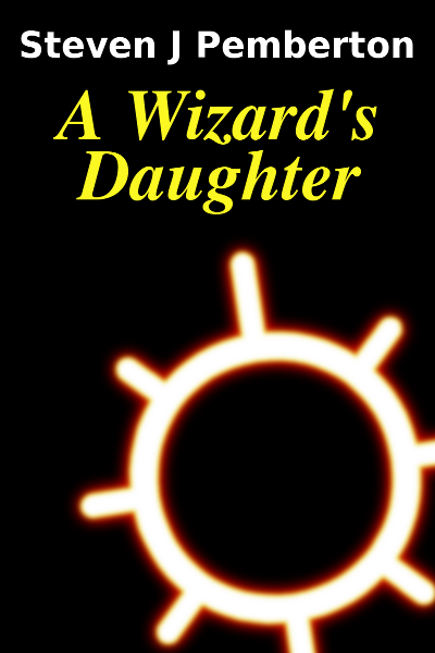
Everything else is good about it [although I did like "A Wizard's Daughter"--perhaps you can sub that in for "Really Awesome Title"!], though. Maybe try giving the symbol another try? It would look a lot more real [and a lot less two-dimensional] if the symbol's lines weren't the same thickness/heaviness on all parts of the hand.

