Yahoo Answers is shutting down on May 4th, 2021 (Eastern Time) and the Yahoo Answers website is now in read-only mode. There will be no changes to other Yahoo properties or services, or your Yahoo account. You can find more information about the Yahoo Answers shutdown and how to download your data on this help page.
Trending News

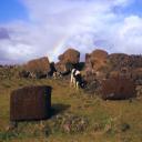
Real Black & White - Comments?
Kodak TMAX 100 film, ND4 and Orange filters. Processed and printed by Dwane's Photo.
Comments?
http://www.flickr.com/photos/drifter45h/8996848360...
http://www.flickr.com/photos/drifter45h/8996848482...
http://www.flickr.com/photos/drifter45h/8996848650...
http://www.flickr.com/photos/drifter45h/8996848748...
http://www.flickr.com/photos/drifter45h/8996848856...
http://www.flickr.com/photos/drifter45h/8996848990...
Dwayne's: http://www.dwaynesphoto.com/
5 Answers
- Johnny MartyrLv 78 years agoFavorite Answer
Hey Edwin, thanks for sharing your work.
I left some comments on Flickr but then decided to share thoughts here as well:
First of all, are these scans of prints or negs? Scanning prints, particularly of 35mm (I take it these are 35mm) is really not the proper way to display photos online so I'll discuss my points in terms of negative scans. If they are scanned prints, I'd rethink your workflow.
The scans seem to have a color tint to them instead of being scanned in b&w mode, they were scanned in color and you apparently did not remove the color in editing. Sometimes this can work but it's not very controlled way of adding color tint to b&w images as it can vary from frame to frame depending purely on scanner type and settings. In other words, the colouration is therefore not deliberate but rather accidental. Most pro labs will scan b&w in b&w mode but I suppose an argument could be made for scanning everything in color at higher bit rates so that all possible tonality is captured before the image is desaturated later.
There also appears to be some brown debris below the center of Image 2 in the grass and in the same area on Image 5, as well as at least one other image I saw in this set on your stream that you didn't link to here. This might be on the negatives and should be cleaned/removed carefully. It's really not cool that a pro lab would leave something, whatever it is, on your negs like that. As for the scan, it could simply be cloned out.
There are also numerous specs of white dust on these images in differing regions--not something I find acceptable for a pro lab. Dusty negs indicates improper working conditions such as drying negs in unfiltered air instead of in a drying cabinet.
Some people leave dust on neg scans but I only do this if the whole image is meant to have a gritty feel and I don't get that impression from this series. I use a spot heal brush set to content aware to clone out dust on my scans but I try to keep the negs clean and blow them off with canned air before scanning to begin with.
I feel you could pull your black levels in a bit too and maybe burn in some of the highlights. There just is not much in terms of shadow, the image has a grey/flat feeling as a result. I really don't understand why this happened if you were using an orange filter other than that the scanner settings flattened out the contrast of the negs OR the negs were processed in such a way as to reduce contrast.
Also, there appears to be some white trim left at the top of the frame that could be cropped out. It's typical to get some trim left over when scanning but unless it adds to the image somehow, I think it should be cropped.
Overall, I think some of your compositions are somewhat weak. It helps me when composing to mentally break the frame up into thirds both horizontally and vertically. Some people like to use a Fibonacci template also. If you have not studied the rule of thirds or the goden ratio, these are worth looking at. Composition is critical for these kinds of images.
I will say, however, you did a nice job at selecting settings to blur the water and get maximum depth of field. The images are not as sharp as they probably could be (particularly if these are scans of prints) in part because you stacked filters. Maybe softness is what you wanted though?
Anyway, I hope this feedback is useful!
METAL AND MANUAL! FILM FOREVER!
- jeannieLv 78 years ago
I am assuming these are just straight scans. The highlights are blown out in pretty much all of them, which I am attributing to machine printing and auto scanning. I am assuming there is information in the negative which you can print out in a darkroom.
Hamer Creek F and B: Both have movement at the bottom, still scene at the top. It is like looking at 2 images, not one. The eye is consistently pulled down to the lower right corner(s) by the movement so the framing doesn't gel well. Shoot 2 photos. Hamer creek C has the same issue.
Hamer Creek E: the best one to my eye - I would consider cropping out the reflections to just show the three rocks and a little of the silky water. The water in the corner again pulls the eye away from the rest of the image. Same with the grass ones. Crop just above the first rise in the creek. The background is not adding anything.
The ones with the orange filter are printed too flat. More time, higher filter. Probably there was no compensation for the change in negative density when it was printed so the prints are flat and so is the scan.
Thanks for posting some real black and white. Even with machine prints and auto scans, these look better than the crap the kiddies post on, well, everywhere.
- NathanLv 68 years ago
I prefer Neopan Acros 100 to Tmax 100. Much nicer tonality. Tmax is a nice though.
The printer has given the photos a bluish cool look. He hasn't compensated for the base colour, when scanning the film. (commercial labs, even dwaynes, scan and print using a light printer rather than optically enlarge. It's more economical and faster)
- david fLv 78 years ago
Pleasant enough, but with a distinct colour cast (blue/green) on my screen. I know that this may be heresy, but for me the whole point of putting a roll of b&w through my camera (XP2 Super in my case) is to ask the processor for dev. only and contact sheet, and to do my own printing.
- Anonymous8 years ago
So so, plus they have a blueish hue