
Yahoo Answers is shutting down on May 4th, 2021 (Eastern Time) and the Yahoo Answers website is now in read-only mode. There will be no changes to other Yahoo properties or services, or your Yahoo account. You can find more information about the Yahoo Answers shutdown and how to download your data on this help page.
Trending News

Fantasy readers - which of these covers do you dislike least?
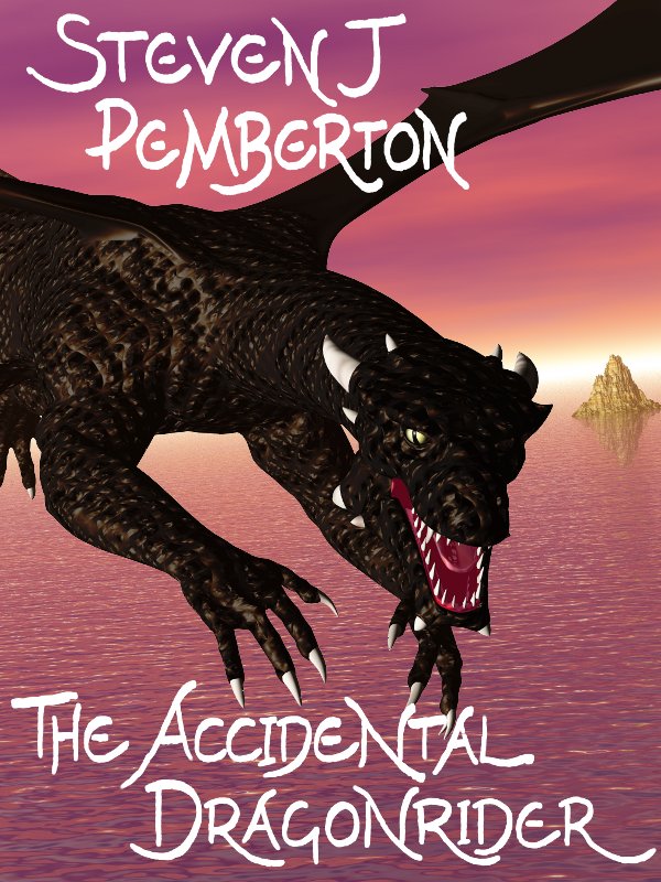
I'm getting ready to release my next book, and am hearing conflicting opinions about which cover to use. If you like fantasy, which of these would be most likely to make you click to find out more?
A: http://www.pembers.net/ad/cover-4-front-only-600x8...
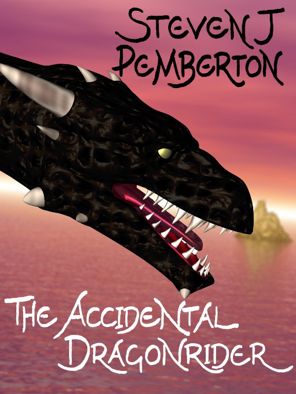
B: http://www.pembers.net/ad/cover-5-front-only-600x8...
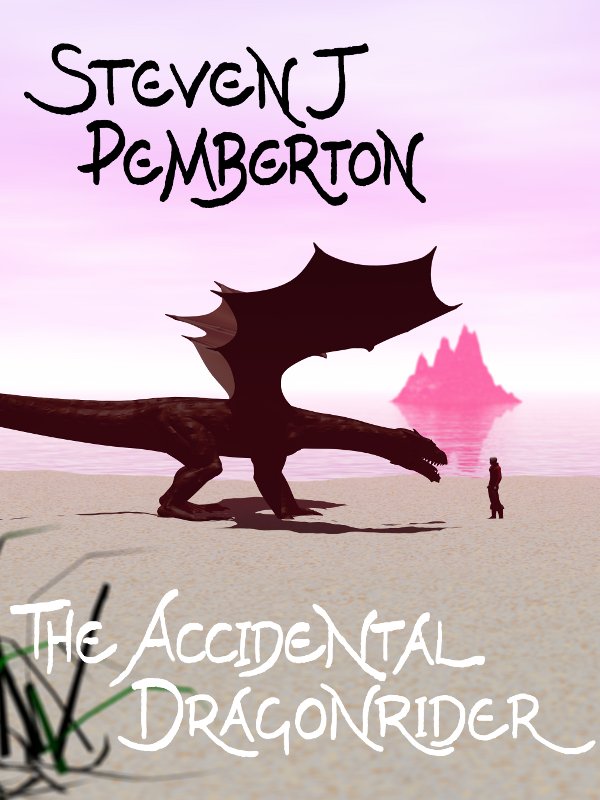
C: http://www.pembers.net/ad/cover-7-front-only-dof-6...
If you think they're all crap, that's OK - I'm asking which you think is least crap. If you have any suggestions for improving what's here, I'd be pleased to hear them.
The winner is pretty clear - about 2/3 in favour of C. There isn't really a right answer to this question, so I'll give Best Answer to the one who made me think the most. Thanks everyone!
27 Answers
- Kal AlvarLv 67 years agoFavorite Answer
The third one is my favourite.
While the first one has a good, exciting angle, it doesn't include the mysterious rider that the title mentions.
The second one seems to Eragon-esque.
But the third one has the dragon and the rider. The two are also in a situation where the reader is not sure what is going to happen, creating a sense of suspense, which is exactly the purpose of a title and cover page.
Good luck!
- 7 years ago
Hi Steven. I like the third one. I like that it's silhouette-ish and that the rider is in the picture. It's a tranquil location where something exciting is about to happen. If I saw this one in a bookstore (or Amazon) I would pick it up and read a sample and the synopsis. Just like The Mirrors of Elangir did.
Oh and the colours aren't overly garish.
- 7 years ago
Wow! For me it is an honor answer a question yours. I think you're very intelligent and insightful guy.
Well... I loved all three. But I enjoyed the third. You really are amazing. I'd love to read your book.
Good luck! ♡
- ?Lv 77 years ago
To be frank, I'm not impressed with any of them; the standard of the artwork - though vastly better than anything I could manage - is off-putting. But if forced to choose, I'd go for the second.
Also, I loathe the font.
Sorry.
- PegathaLv 77 years ago
I would really like the second one best if you added a profile of the dragonrider's head, looking the dragon right in the eye, up close.
But with no changes, I like the third one best. (If the title says "dragonrider," then I expect to see a dragonrider somewhere on the cover.)
- 7 years ago
I'd say the last even thought I think more detail would be better... I don't know it looks a little too computer animated.
- 7 years ago
The third cover is the best. The first is good but it doesn't show a rider, meanwhile the third one does.
- 7 years ago
I like the first one the best. The dragon looks as real as it's going to get with whatever software you used.
- 7 years ago
I think that the last is the best. The title indicates that there is both a dragon and a human (the rider) so to include both on the cover seems to make more sense.


