
Yahoo Answers is shutting down on May 4th, 2021 (Eastern Time) and the Yahoo Answers website is now in read-only mode. There will be no changes to other Yahoo properties or services, or your Yahoo account. You can find more information about the Yahoo Answers shutdown and how to download your data on this help page.
Trending News

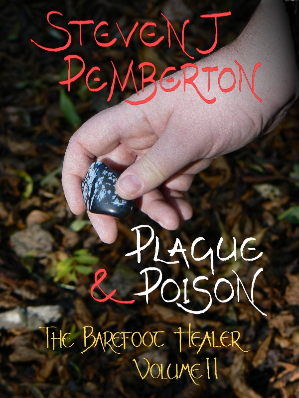
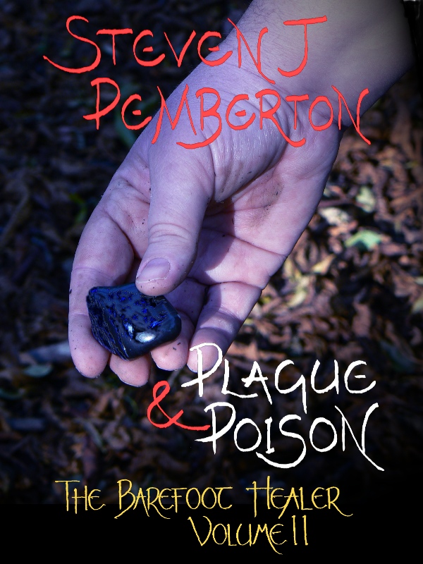
Fantasy readers - which of these cover designs is better?
So the second book in my fantasy series is coming out soon, and I've been trying to come up with a design for the cover. I have a fair idea what I want, but can't decide between two different versions, linked below:
http://www.pembers.net/test-1.jpg
http://www.pembers.net/test-2.jpg
Which do you think is better - or which would be more likely to make you click through to find out more about the book? Feel free to chip in if you think neither is particularly good...
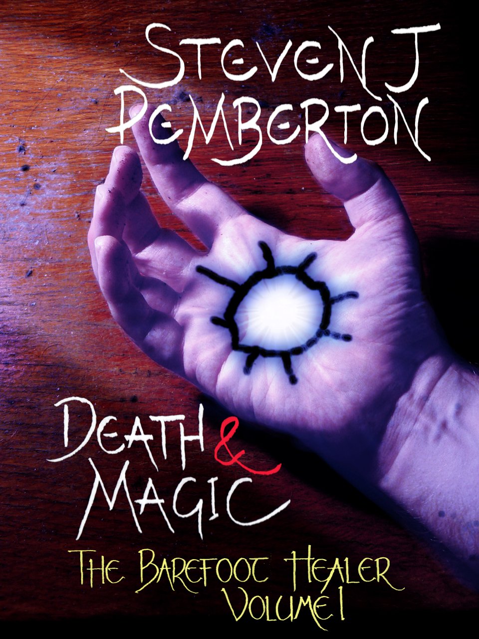
I want some continuity with the cover for the first book, which is here: http://www.pembers.net/wd/death-and-magic-cover-96... That's the main reason for the blue cast on the second version. Thanks!
Thanks everyone. I wasn't expecting it to be that clear-cut. The hand on the cover of Death & Magic is mine; this one is my partner's. I used the same camera for both, so I'll have to investigate why this one looks more realistic than the other.
@Seal - it's not meant to be Adramal's hand. I prefer the pose on the first one, but the second one seems to allow me to better fit the text around it. Here's a "behind the scenes" photo for those of you who like that sort of thing.
17 Answers
- 10 years agoFavorite Answer
Hi, Steven! (:
Haha, yay! Second book already? Congratulations!
Forgive me if I go off on a long spiel about the particulars. I do a lot of CG practice, so I love picking at little details.
If my choices are confined to the two, I'll definitely pick the second one.
The placement of the hand on the cover in the second one is better. It's between the author's name and the title, right in the middle, which is exactly where the first one is, but the hand in the second one is in a position that makes it larger of an image. It takes up more space, creates more distance between your name and the title, elongates the cover, and doesn't make it look as small as the first one. Both covers are the same size, but if you flick between them on different tabs, the latter gives off the impression it is a longer image. It's preferable.
Also, the hands themselves. The first hand seems to be picking up the stone; the second seems to be showing it to the reader. The second one gives off the better effect.
As for the focal point, which is again, the hand. The first hand is made prominent by being more clear-cut than the background - macro. The blue light is also a nice touch. It makes the nature in the background less noticeable, but the blue light simultaneously dulls the edges of the hand, so that it's not as defined an image as the first. The way the light becomes whiter at the palm of the hand compensates for this, draws attention to it in contrast to the darker ground below - if I'm correct in assuming that's the ground. The whitish light by the palm of the hand also illuminates a small fraction of the ground behind the palm, so that the background isn't entirely unintelligible. I like that.
If I could, I'd just like to make two little suggestions. First, the words - I think the series name and volume number should be made a little smaller, and that either the title or your name - one or the other - should be bigger than the other. Second, the colour of the words - the red-cerise colour fits the first cover very nicely, but I don't really like it with the blue.
Feel free to ignore anything I've said, really, please. Or, if I've been obnoxiously insensitive, just slap me in an e-mail and say, "Maine, you're such a jerk!" Or a motor-mouth. Or a female dog. And I'll reflect on my sins later tonight.
All the best with your series and writing, Steven! Good luck with all the novels to come (:
♥ ϻαiɳε
EDIT: Haha, aah! Sorry for assuming that it was the ground. Just replace any time I mentioned the word "ground" with "leaves" in my answer...
- ?Lv 410 years ago
Yes, I think you're going to get near universal acclaim on the second. However, I must say that the first is better positioned and seems a lot less...amateur. The second looks like it could be made by a high school freshman. The first is a little more complex to me, and gives us hints as to what he is actually doing with the stone.
To be brutal, I don't think they're good covers and I probably wouldn't pick one up off a shelf. They do honestly look like amateur covers...heck, I've seen better covers on inkpop. I realize your books aren't popular yet, but maybe you should look around for something.
Another flaw in your question is you didn't explain what they're trying to do. You gave us two different propositions, really. 1=picking/finding a stone. 2=Giving/taking a stone. Just choose whichever one you like best, because when you stop doing it for yourself, then you have no muse, no purpose.
To clear up, one, in my opinion, is better. People will disagree with me, but I gave my honest opinion and backed it with clear-as-day evidence. Thank you for posting and good luck.
- Spec TacLv 610 years ago
Second for sure. It gives a slight surreal or fantastical tone to the image, where the first looks simply too realistic to be a cover of a fantasy book. Better consistency with the first.
- ?Lv 510 years ago
Congrats for the second book :D
The second option is much better. If it ever came across your mind that it doesn't look like the stone is being picked up in test two, well for me the stone is still being picked up. The differences that I liked between the two is that the second has a darker tone which sort of sets the story for me and the hand is more opened to the reader, showing the full stone. Nothing's unintentionally obstructing it. :)
- 10 years ago
I love the earthy feel of the first cover. I like the second one too, but I'll only prefer it as the cover if the person's hand in the 2nd picture is supposed to be of a dead person. The purplish glow has a poison feel to it which works with the title, but I prefer the first because it just clicks for me. I get the forest vibe from the first one which immediately takes me to the fantasy place inside my head...
- JossLv 710 years ago
Probably #2.
Not really my taste in covers. And, the cover for Death and Magic has an illustrated feel to is, like you created it in some drawing program. The two test ones just looks like someone's real hand (which it is, I"m sure). I dont like the first one because the hand looks too short and stubby from that angle.
BTW, is that your hand?
Oh, and before I forget, the second is a bit more similar to the first - and I'm stretching here - because of the dirt on the palm. - this isn't as articulate as it should be. :D
- ?Lv 610 years ago
I think I like the second one better but who is suppose to be holding the rock (male or female) in terms of your book? I think the hand doesn't look realistic enough (I know its a real hand) but it looks to posed... does that make sense? I am not sure it does. Lol hope I helped?
Source(s): ♥Scotty McCreery - ★ Xenon ☾Lv 610 years ago
Mr. Pemberton! I haven't answered any questions from you for a long time.
I really like the second version the best. The blue light gives it a more magical/mysterious feel and it goes along with the title better.
- SealLv 510 years ago
I like the hand pose/angle of the first one better, but the blue cast in the second is nice.
Everything else is pretty good, but just out of curiosity, is the hand meant to be Adramal's? Looks like a man's hand to me, so I'm a bit confused.
Good luck with your book. :D
- SazwonderzLv 710 years ago
The second. It gives off a similar essence to the first, and looks more mysterious.
I think you could soften the right hand side of the hand a little - it gives the impression that it has been stuck on top of the image, but it's not that important.


