
Yahoo Answers is shutting down on May 4th, 2021 (Eastern Time) and the Yahoo Answers website is now in read-only mode. There will be no changes to other Yahoo properties or services, or your Yahoo account. You can find more information about the Yahoo Answers shutdown and how to download your data on this help page.
Trending News

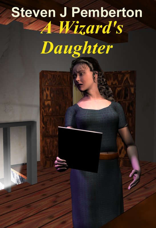
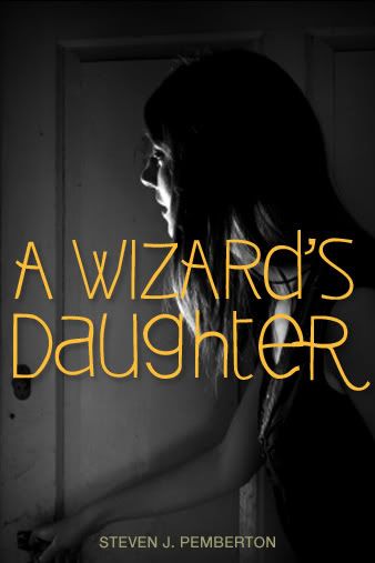
YA fantasy readers - what do you think of this cover design?
Someone who's designed a lot more book covers than me thought the current cover for my book on Authonomy was a bit... uninspired. So I thought I'd knock up something that better reflects what the book is about, and I'd be grateful for any opinions on it. The current attempt is at:
http://www.pembers.net/wd/test-composite-2.jpg
A couple of specific questions -
Does it say loud and clear "this is a young adult fantasy novel"?
And does it say loud and clear "you must read this"?
Don't hold back - I'm quite prepared to hear "no to both". I'm aware there's a lot wrong with it on a technical level, but I thought I'd try to figure out whether I'm heading in vaguely the right direction before I spend weeks tweaking the textures and lighting and the way the character's hair falls...
(Suggested categories: Sports -> Fantasy Sports, Entertainment & Music -> Magazines. Sigh...)
You can stop kicking me now... I get the message :-)
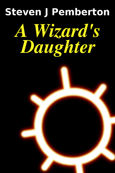
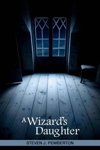
Some of you have found the original already, but if you want to see it, here's a larger version: http://www.pembers.net/wd/authonomy-cover-large.pn...
If it looks like a screenshot from a computer game, that's not good... I'm out of touch with what game graphics look like nowadays - I don't play anything much more complicated than Tetris :-)
I realise that I should probably pay someone who knows what they're doing to do this job for me, but that would require me to be earning money from the book, which I'm not at the moment. I'm confident that the story is good, but I haven't had any success so far in persuading professionals to agree with me. Therefore, I'm considering putting it out as an ebook, so that it has some chance of earning more than the nothing it's earning at the moment.
You can fight among yourselves over who gets the ten points...
18 Answers
- HP WombatLv 71 decade agoFavorite Answer
I'm a graphic designer by profession, and it's glaringly obvious that this book cover isn't up to par with traditionally published book covers.
I say either go with a text treatment that is more YA feeling, like this:
http://i730.photobucket.com/albums/ww307/Random_Sa...
And definitely go with photography, not CGI, ESPECIALLY if there's a person on the cover. Yeah, stock photography can get expensive, but it's worth it, when it comes to quality.
- ?Lv 51 decade ago
To be blunt, its not very good. Putting all the technical stuff aside (because this obviously isn't finished), I think it's rather boring and gives no indication that this is a YA fantasy novel. The background bothered me most of all---its so bland and empty. I don't see why you'd choose that location to put on your front cover. The most interesting thing about it is the girl's expression, but that's not enough to make me want to pick up this book and read it. Honestly, this cover looks cheap and vague and boring. Sorry to be so harsh, but you did ask for honesty. And I do agree with some of the other answerers that the 3D cgi thing isn't my favorite. Its just so hard to get that stuff looking good enough to be believable. Maybe thats just a personal prefferance, but anyhow, I thought I'd mention it.
Just of curiosity, what does the original cover look like?
- Kathryn WLv 71 decade ago
@H.P. Resource. Love those covers.
Steven, I think your current design needs some work. I agree that you need to consider photography rather than CGI if you're going to include a picture of your character on the front cover. Come on ... we want to see a great cover to match that great story of yours. And as it is young adult fiction, I would be inclined to use lots of shadows.
To answer your specific questions, the cover does not tell me that it looks like a young adult fantasy novel - the CGI makes me think that the book is a tie-in to a children's animated TV series that I have never heard of. Consequently, it does not make me want to read it.
But still ... the authonomy cover shouldn't be a long term concern. One day you're going to get that publishing contract and have a cover that is designed by professionals.
- 1 decade ago
Honestly, I think the font has a lot to do with it. I like the original cover much better than the new one but the font is still holding it back. It doesn't really read "Young Adult Fantasy." Some of the older edition of Howl's Moving Castle by Diana Wynn Jones also had this problem, in my opinion: http://www.google.com/search?hl=en&biw=1276&bih=54... It's definitely YA but the style of the font doesn't quite translate that way, at least not today.
I use this Font Image Generator site a lot whenever I work on little projects (like birthday cards). It has a wealth of different fonts, it's such a great site. I'm sure you could find something to better suite that second cover. http://www.interactimage.com/ The only thing is that the text appears as a picture that you have to copy and paste, but it's definitely something you can work with and the results are worth it.
By the way, why wouldn't the original cover be any good? Just because it's simple? Personally, I like simple. And maybe you could tweak the image a bit, but I think simple is good- depending on the image, it can give just enough information to tell you something about the book, but withhold enough information to make you want to read. A good cover should do that anyway, whether or not it's simple, but I think there's just something about a simple cover and the way it does it. I don't know. It works for these books, anyway: http://www.google.com/search?hl=en&biw=1276&bih=54...
Edit: I really like HP Resource's answer and her covers, especially the second one.
- A/lieLv 51 decade ago
Hm. I like the idea, but it also confuses me. If it weren't for the big word's saying, "A Wizard's Daughter" at the top, I wouldn't think it was a young adult fantasy novel. I don't know what I would think. I don't know what she's holding, where she is, etc.
However, it does make me want to read the book, maybe because I can't figure anything out from the cover. So maybe that level of mysteriousness is actually good?
Haha, fantasy sports.
- CandleLight <3Lv 41 decade ago
I'm sorry but no to both. It looks more like a crime novel or something. Sadly modern YA books seem to be all black and scary and very simmilar to each other. But I think it is a good thing that it doesn't fit in with that.
I did not think that I would love to read it when I saw it, it looks kind of boring if I'm honest. But I do try to stick to the policy of don't judge a book by it's cover so...
- TaliaLv 41 decade ago
Hmmmm, I’d like to warn you that this is going to be very harsh D: but it’s only because I want the best for you!
I think the "3D" appearance is NOT helping at all, to be honest. It doesn’t scream fantasy… if any genre could be matched with it, it’d probably be Sci-fi or a nonfiction guide on how to play the Sims!
On another note, the font is far from creative or eye-catching… and that includes the color... (idk if that's just because you haven't gotten there yet)
Fantasy books should be whimsical and detailed with swirling fonts that are both elegant and unique (Jellyka!). It should not ever seem clean/plain and overly simple.
While the woman’s hair and expression are both excellent and the artwork as a whole is great, I don’t think it is at all fitting for a book, let alone a fantasy book! I’m sure that it took a lot of work to make and would look fantastic on deviantART, but as a book cover, it just doesn't work... If I were to judge this book by it's cover, I probably wouldn't get it. It doesn't scream YA fantasy!
Fantasy book covers for YA normally are photographs/photomanipulations or they appear to be traditionally painted (although I'm sure many are digitally painted xD).
Sorry for the harshness D:
However, if you add a TON of detail and make it seem less computer generated, the pose and all seem fine :)
- SealLv 51 decade ago
Honestly, I didn't like either one. The last one seemed a bit like it was quickly done on MS Paint, the new one makes me think of the Sims and isn't particularly intriguing for a YA fantasy novel - you know, makes me think of a Sims girl picking up a book and going "Oh, no! An ugly book!" Not exactly very terrifying - anyway...
Personally, I'm partial to the types of book covers that focus on just one thing - a symbol, an illuminated object, something along those lines and the backdrop kind of unclear or not as prominent. Maybe just my taste but it seems like most YA novels at the local store seem to somewhat follow that style.
http://3.bp.blogspot.com/-CvPk6mMID_M/TcLSJPdqWhI/...
http://media.ove.cybermage.se/2010/01/fire-by-kris...
http://cdn1.iofferphoto.com/img/item/150/875/973/2...
http://4.bp.blogspot.com/_TW1J1BSHXvs/TNTAhQ3A9VI/...
The Twilight series also had good covers in my opinion, although they were mainly targeting teen girls - an apple, chess piece, ribbon, flower, etc.
The Hunger Games focuses on just one symbol and the rest is mostly solid color.
Anyway, hope that was somewhat helpful. Those are all currently popular YA books, I believe. Good luck.
- 1 decade ago
I really don't like it. It looks to graphic, without any effort. I know your not supposed to judge a book by it cover, but I've noticed that books with great covers means a great story. If I saw this in a store, I may not even pick it up.
- It does not seem like a YA fantasy to me, more like a realist fiction.
- As I said before, I would not even pick it up.
Sorry, but I really think it looks crappy. I love YA fantasy books, they are practically all I read, but I really can't see myself picking up this books and saying to myself "oh my gosh, this is such a great cover. I just have to buy it even if the story sucks" (I tend to do that sometimes:))
- chorleLv 71 decade ago
the first picture reminded me of that second life I keeping hearing about.
The second was better but I think painted, lifelike drawing or photo would look better
I wonder if you like my twitter friend JR Murdock's book cover
I was looking a the covers of Diane Duane's books but I don't the current covers being the same as when I bought them. They seem more complex than I remember.
Source(s): http://www.amazon.com/Astel-Chosen-ebook/dp/B004RJ... http://www.amazon.com/Complete-Wizards-Wizardry-Di... - 1 decade ago
I can't believe no-one's already said this ... STEVEN ASKED A QUESTION! YAHOO!ANSWERS HISTORY HAS BEEN MADE! *hysteria over* Isn't that only your third or fourth question?!
I have to say, it's interesting but with people on covers, I wouldn't go for graphic art :/ photography/drawing works a lot better.
It doesn't say loud and clear that 'this is a young adult fantasy novel.'
It doesn't say loud and clear that 'you must read this.'
Sorry :/


